
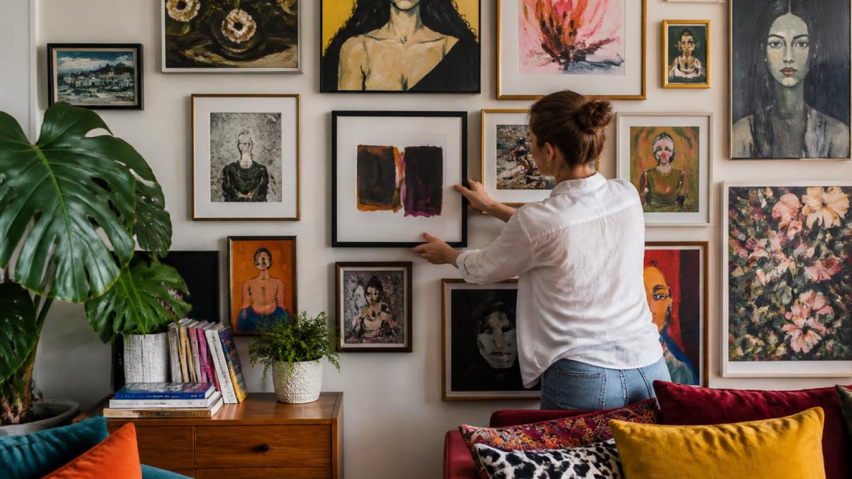
 how-to
How to Choose Wall Art for Maximalist Living Rooms
Table of Contents
- What You'll Need Before You Start
- Maximalist Interior Design Rules That Keep Bold Art From Looking Chaotic
- Step 1: Build a Core Color Palette Before You Buy Maximalist Wall Art
- Step 2: Choose Art Sizes and Shapes for Living Room Walls
- Step 3: Plan Your Maximalist Gallery Wall Ideas
- Step 4: Mix Styles, Frames, and Textures Without Clashing
- Step 5: Balance Bold Art With Existing Decor and Visual Weight
- Step 6: Light Your Maximalist Wall Art So the Colors Read True
- Step 7: Add Quirky Home Decor for Daydreamers Without Overcrowding
- How to Avoid Visual Clutter and Maintain Your Maximalist Gallery
- Frequently Asked Questions
Last Updated: September 27, 2026
What You'll Need Before You Start
Learning how to choose wall art for maximalist living rooms starts with one shift in thinking: maximalism is not clutter. It is controlled abundance. This guide from YleaCreations walks you through the exact steps we use when styling bold, layered walls that still feel calm to live with.
Before you buy a single frame, gather these basics:
- A tape measure and painter's tape
- Paper or cardboard for tracing frame sizes
- Paint swatches or fabric samples from your sofa and rug
- A phone camera for snapping your wall in daylight
- A notebook for tracking sizes, colors, and frame finishes
One mistake trips up almost every beginner. They shop for art first and plan the wall second.
That order guarantees chaos. Plan the wall, then buy the art.
Maximalist Interior Design Rules That Keep Bold Art From Looking Chaotic
Maximalist interior design rules give structure to abundance. Without them, "more" just reads as messy.
The core principle is intentional layering. Every piece should earn its place. Color, scale, and texture all repeat somewhere else in the room, so nothing feels random.
Two rules do most of the heavy lifting.
The 2/3 Rule and the 3-5-7 Rule, Translated for Real Walls
The 2/3 rule says at least two-thirds of your wall art should share a common thread. That thread might be a color, a frame finish, or a mood. The remaining third can break the pattern for surprise.
The 3-5-7 rule governs grouping. Odd numbers of pieces feel more dynamic than even ones. So you build clusters of three, five, or seven items rather than four or six.
Here is how that plays out on a real wall:
| Rule | What It Controls | Example |
|---|---|---|
| 2/3 rule | Cohesion | Six of nine pieces share warm tones |
| 3-5-7 rule | Grouping | A cluster of five frames, not four |
| Scale rule | Proportion | Largest piece is about 2/3 the width of the sofa |
| Spacing rule | Breathing room | 5-8 cm between frames |
Apply these three and your wall reads as curated, not accidental.
Step 1: Build a Core Color Palette Before You Buy Maximalist Wall Art
Start with color, because color is what makes a maximalist room feel intentional instead of loud.
Pull three to five colors from what you already own. Look at your sofa, rug, curtains, and even a favorite cushion. Those become your core color palette.
Then decide how warm and cool tones will mix. A room that leans warm can handle one or two cool accents for contrast. A cool room benefits from warm pops.
- Pick 2 dominant colors for the biggest pieces
- Choose 2 accent colors for smaller art
- Add 1 wildcard color for a single statement piece
This is where abstract artwork and line art earn their keep. Abstract pieces carry color without adding busy detail, so they hold a wall together. Line art adds lightness when the wall feels heavy.
Step 2: Choose Art Sizes and Shapes for Living Room Walls
Size mistakes ruin more maximalist walls than color mistakes. Too-small art on a big wall looks timid. Too-large art in a small room feels crushing.
The fix is simple math. For a wall above a sofa, your art arrangement should span roughly two-thirds to three-quarters of the sofa's width. Height should fill the space between the furniture and the ceiling without crowding either.
Mix shapes on purpose:
- Large-scale prints anchor the composition
- Medium rectangles fill the middle ground
- Small squares and circles add rhythm
- One oversized print creates the focal point
You can find useful guidance on proportion and placement from The Spruce's guide to hanging art, which covers standard height rules that keep a busy wall readable.
Hang the center of your arrangement at eye level, roughly 145-150 cm from the floor. That single measurement prevents the most common hanging error.
Step 3: Plan Your Maximalist Gallery Wall Ideas
Maximalist gallery wall ideas live or die on layout. Plan the whole wall on paper or the floor before a single nail goes in.
Lay your frames out on the floor first. Rearrange until the composition feels balanced. Then trace each frame onto paper, tape the paper to the wall, and step back to check it.
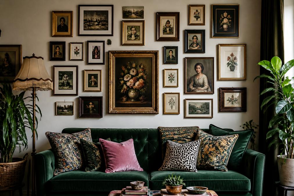
Layout Options: Grid, Salon-Style, and Organic Clusters
Three layouts cover almost every maximalist wall:
- Grid: Frames align in even rows. Best for a calm, ordered look within a busy room.
- Salon-style: Frames fill the wall edge to edge, floor to ceiling. Best for high walls and dramatic rooms.
- Organic cluster: Frames radiate outward from one center point. Best for stairwells and odd-shaped walls.
Pick one layout and commit. Mixing layouts on the same wall creates the chaos you are trying to avoid.
For more on arranging mixed frames, Architectural Digest's gallery wall guidance is a solid reference on spacing and balance.
Step 4: Mix Styles, Frames, and Textures Without Clashing
Texture mixing is what separates a flat wall from a rich one. The trick is to vary materials while repeating one or two constants.
Repeat your frame color family, then vary the finish. Gold, black, and natural wood can all live together if they share warmth or tone.
- Pair smooth metal frames with rough woven textures
- Set glossy prints beside matte ones
- Add one dimensional piece, like a small sculpture or textile
High and low mix matters here too. A flea-market find beside a framed print creates the layered, collected feel maximalism is known for.
What most guides miss is that clashing styles need a referee. That referee is your palette. If two pieces share a color, they can differ in every other way and still work.
Step 5: Balance Bold Art With Existing Decor and Visual Weight
Visual weight is how heavy a piece feels on the wall. Dark colors, thick frames, and large sizes all add weight. Light colors, thin frames, and small sizes reduce it.
Balance works like a scale. A heavy piece on one side needs lighter pieces or empty space on the other.
- Give every heavy piece room to breathe
- Cluster light pieces together to balance one dark anchor
- Leave deliberate gaps so the eye can rest
Your existing decor sets the ceiling for how much you can add. A room with bold wallpaper can take fewer, larger pieces. A neutral room can handle more.
Step 6: Light Your Maximalist Wall Art So the Colors Read True
Lighting is the step almost every guide skips, and it is the difference between a gallery wall that glows and one that reads as a dark, cluttered mess. In a maximalist room, where dozens of frames compete for attention, light is what tells the eye where to land first.
The goal is layered, adjustable light. You want three jobs handled: overall room glow, focused art illumination, and accent grazing for texture.
Match the Bulb to the Art
Color temperature changes how art reads. Warm light (around 2700K) flatters oil paintings, wood frames, and warm-toned prints. Neutral light (around 3000K) keeps blues, grays, and cool abstracts from turning muddy. A common pattern is to keep one temperature per wall so the art does not shift color from frame to frame.
Color rendering matters as much as temperature. Look for bulbs rated 90 CRI or higher. A high-CRI bulb shows reds, greens, and skin tones in art the way they were painted, while a low-CRI bulb washes them out. ENERGY STAR's lighting resources explains how bulb choices affect how colors appear in a room.
Three Lighting Layers for a Busy Wall
- Ambient: A dimmable ceiling fixture or floor lamp sets the base level. Keep it soft so it does not compete with the art.
- Task/accent: Picture lights mounted above frames, or adjustable wall sconces, wash individual pieces evenly. Aim for one light source per cluster, not per frame.
- Grazing: Angle a spotlight or track head to skim across a textured canvas or dimensional piece. The shadow it casts adds depth that flat frontal light kills.
Placement Rules That Prevent Glare
- Mount picture lights so the beam hits the top third of the frame, not the glass.
- Keep light sources at least 12 inches from glossy or glass-covered art to avoid hot spots.
- Use a dimmer on every circuit so you can shift from bright daytime viewing to a moody evening glow.
- Avoid recessed downlights directly above art, they cast shadows under frames and create glare on glass.
Light each cluster as a unit. One well-placed source per grouping keeps the wall readable and stops the eye from bouncing between competing highlights.
Step 7: Add Quirky Home Decor for Daydreamers Without Overcrowding
Quirky home decor for daydreamers is the personality layer. This is where a room stops looking styled and starts looking lived in.
Add pieces that mean something. A framed print of your dog. A bold animal illustration. A small oddity you found on a trip.
The rule is one story per zone. Each cluster gets one piece with a personal story, and the rest support it.
This is also where budget-friendly maximalism shines. You do not need expensive art to build a bold wall. Mix prints, textiles, and found objects.
At YleaCreations, our colorful animal art and mood-lifting designs are made for exactly this layer. They add personality without demanding a whole wall.
How to Avoid Visual Clutter and Maintain Your Maximalist Gallery
Avoiding visual clutter in a maximalist room is not about having less, it is about maintaining what you have. A wall with 20 or more frames collects dust, fades in sunlight, and slowly drifts out of alignment. Regular upkeep is what keeps abundance from sliding into chaos.
The Monthly Edit
Once a month, step back and scan the wall with fresh eyes. Ask one question per piece: does this still earn its place? If a frame feels like filler, pull it. Rotate it to another room or store it for a season. This single habit prevents the slow accumulation that turns a curated wall into a cluttered one.
Cleaning a Dense Gallery Wall
Dust is the enemy of a busy wall because it dulls color and texture. Use a dry microfiber cloth on frames, never a paper towel, which can scratch metal and leave lint on glass. For glass, use a streak-free spray applied to the cloth, not directly on the art, and wipe in one direction.
- Dust frames every two weeks with a dry microfiber cloth
- Clean glass monthly with a streak-free spray and a soft cloth
- Use a soft brush or canned air on textured or dimensional pieces
- Check hanging hardware twice a year for loose nails or wire
Protecting Art From Light and Heat
Direct sunlight fades prints, watercolors, and textiles faster than anything else. If a piece sits in a sunbeam, rotate it to a shadier spot every few months, or add a UV-filtering glazing when you frame it. Keep art away from heating vents and radiators, which dry out paper and warp frames.
Seasonal Rotation
Rotate one or two pieces each season. This keeps the wall feeling alive and lets you test new combinations without buying anything. Store unused art flat, wrapped in acid-free paper, away from damp basements and hot attics.
At YleaCreations, our colorful animal art and mood-lifting designs are built to be rotated and recombined, so your wall can evolve without losing its story. [LINK: Shop YleaCreations wall art | yleacreations.com]
Frequently Asked Questions
What is the 2/3 rule for wall art?
The 2/3 rule says art should cover about two-thirds of the wall width above a piece of furniture, such as a sofa or console. In a maximalist living room, you can push closer to three-quarters because layered frames and oversized prints are part of the look. Measure your furniture first, then mark the target zone with painter's tape before hanging anything.
How do you mix and match art styles in a maximalist room?
Pick one anchor piece, then choose everything else to echo one element of it, such as a color, a frame finish, or a subject. Repeat that thread across your maximalist wall art so abstract artwork, line art, and photography feel connected rather than random. Keep at least one shared trait between every neighboring piece to hold the arrangement together.
How do you create a cohesive gallery wall without it looking cluttered?
Work from a core color palette of three to five colors and pull every frame, mat, and print from that set. Space frames 1 to 2 inches apart so the group reads as one unit, and leave breathing room around the outer edge. Intentional layering keeps the wall bold while visual clutter stays under control.
How do you choose wall art that reflects your personality?
Start with subjects you already love, like animals, travel, or humor, and build outward from there. Mix high and low pieces: a framed print next to a thrifted find or a handmade piece. Quirky home decor for daydreamers works best when each item means something to you, not when it matches a catalog page.
Building a maximalist wall that feels bold instead of busy takes planning, color discipline, and a little courage. YleaCreations makes that last part easy with colorful animal art, expressive prints, and mood-lifting pieces designed to reflect your personal style. Browse the collection, find the piece that feels like you, and start layering. Get started with YleaCreations and turn your living room wall into a story worth telling.