
 blog
blog
Vibrant Color Clothing for Middle-Aged Women: A Style Guide
Table of Contents
- Why Vibrant Color Clothing Matters at This Stage of Life
- How to Choose Colors That Flatter Your Skin Tone
- Graphic Tees for Women: Making Bold Statements
- How to Style Bold Colors Without Overdoing It
- Color Blocking Techniques for Mature Women
- Fashion Tips for Women Over 50: Building Confidence
- Creating a Capsule Wardrobe with Vibrant Pieces
- Transitioning from Neutrals to Bold Hues
- Conclusion: Embrace Your Colorful Self
- Frequently Asked Questions
Last Updated: September 27, 2026
Why Vibrant Color Clothing Matters at This Stage of Life
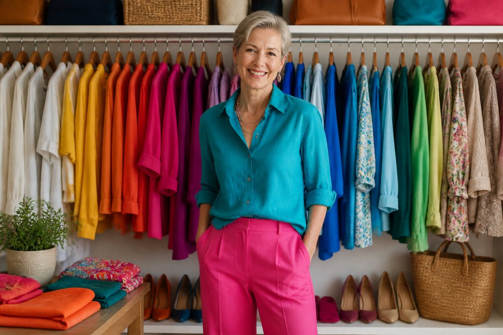
Wearing vibrant color clothing for middle aged women isn't frivolous, it's strategic. The right bold hues can lift your mood, shift how others perceive you, and fundamentally change how you feel about yourself. This isn't about chasing trends or pretending you're 25. It's about claiming your space with confidence and color.
Many women hit midlife and unconsciously retreat into blacks, grays, and beiges. The reasoning is familiar: "I'm too old for bright colors" or "Bold tones don't suit me anymore." But that's a narrative worth challenging. Your skin tone changes with age, yes. Your style preferences evolve, absolutely. But your right to wear what makes you feel alive? That never expires.
At YleaCreations, we believe vibrant color clothing for middle aged women can transform not just wardrobes, but confidence levels. When you wear a color that feels authentically you, whether that's a jewel-tone teal or a warm coral, you stand differently. You speak differently. People respond to that energy.
The psychology is real. Color influences mood and perception. A saturated hue against your skin creates visual contrast that draws attention to your face, not away from it. Bright colors signal vitality and intentionality. They say: I know who I am, and I'm comfortable in my own skin.
How to Choose Colors That Flatter Your Skin Tone
The foundation of wearing vibrant color clothing for middle aged women confidently starts with understanding your undertones. Your skin undertone, warm, cool, or neutral, determines which saturated hues will make you glow versus drain you. But here's what most color guides miss: your undertone and skin contrast don't stay static after 40.
Understanding Your Base Undertone
Warm undertones (golden, peachy, or olive-leaning skin) shine in jewel tones with warmth: deep oranges, warm reds, golden yellows, terracotta, and warm greens like olive or sage. These colors create harmony with your natural pigmentation.
Cool undertones (pink, rosy, or blue-leaning skin) are flattered by jewel tones with cooler bases: true reds, berry shades, sapphire blues, cool purples, and emerald greens. These create a complementary contrast.
Neutral undertones (balanced warm and cool) have flexibility. You can wear both warm and cool vibrant shades, though you'll likely have a preference. Test both sides of the spectrum.
How Aging Skin Changes Color Dynamics
As skin matures, several shifts occur that directly impact which vibrant colors work best:
-
Loss of natural contrast: Skin becomes more uniform in tone as freckles fade and pigmentation evens out. This means the contrast between your skin and a vibrant color becomes more important, not less. A saturated jewel tone compensates by creating visual pop your skin may no longer generate naturally.
-
Reduced undertone saturation: The warm or cool undertone you've always had may appear more muted. Warm undertones can shift toward more golden-olive; cool undertones may read as less rosy. This doesn't mean your undertone changed, it means the saturation decreased. Respond by choosing more saturated vibrant hues, not less.
-
Increased sensitivity to cool tones: Many women find that cool colors (especially true reds and icy blues) can emphasize redness or fatigue around the eyes after 45. If this applies to you, lean toward warm-based jewel tones (warm reds, sapphire over icy blue, warm purples) or test colors in natural daylight before committing.
-
Skin texture and light reflection: Mature skin often has less luminosity. Matte or satin-finish fabrics in vibrant colors read better than shiny finishes, which can highlight texture. The fabric itself matters as much as the hue.
The Practical Color Test
Hold a fabric swatch near your jawline in natural daylight (not fluorescent store lighting, natural light reveals true color interaction). Does it make you look energized, or does it emphasize shadows under your eyes or uneven tone? Trust that immediate gut reaction. Your skin knows.
Better yet, test the color against your inner arm or collarbone, where skin tone is most consistent and undertone most visible. A vibrant hue should make that area look luminous, not muddy.
Building Your Personal Color Map
Instead of memorizing a generic color wheel, create your own reference. Photograph yourself in 4-5 vibrant colors that span the spectrum: a warm red, a cool red, a jewel-tone blue, a warm green, and a purple. Take photos in natural daylight. Compare them side by side. You'll immediately see which colors create the most flattering contrast against your skin. Those are your power colors, the ones you return to again and again.
Graphic Tees for Women: Making Bold Statements
Graphic tees are the easiest entry point into vibrant color clothing for middle aged women. They're casual, forgiving, and they let you signal personality without overthinking it. But not all graphic tees are created equal, especially when it comes to holding vibrant color over time.
Why Fabric and Dye Quality Matter for Vibrant Color
A vibrant color is only vibrant if it stays vibrant. Here's what happens with low-quality graphic tees:
-
Poor dye saturation: Cheap dyes don't bond fully to synthetic fibers. The color fades after 5-10 washes because the dye molecules were never locked into the fabric structure. A saturated jewel tone becomes a washed-out shadow.
-
Synthetic fiber breakdown: Low-quality polyester or cotton-poly blends pill, fade, and lose shape quickly. The graphic itself cracks or peels. The "vibrant" color you bought becomes a faded, deteriorating piece within months.
-
Inadequate pre-treatment: Quality manufacturers pre-wash and pre-treat fabric before dyeing. This removes finishes that prevent dye absorption. Skipping this step means the color never truly sets.
What to Look For in a Quality Graphic Tee
When evaluating vibrant graphic tees, check these specifics:
-
Fabric weight: A quality tee weighs 5.3-6.0 ounces per square yard. Anything under 5 ounces will feel thin and won't hold color as well. Heavier fabric resists fading and pilling.
-
Fiber content: 100% cotton or a high-cotton blend (at least 90% cotton, 10% polyester for durability) holds vibrant dyes better than pure synthetics. Cotton fibers have a porous structure that allows dye molecules to bond deeply.
-
Dye method: Look for "reactive dye" or "fiber-reactive dye" on the label. This is a chemical process that bonds dye permanently to the fiber. It's more expensive than basic direct dyeing, which is why quality tees cost more.
-
Seam construction: Flat-lock seams or reinforced stitching indicate a piece built to last. Cheap tees have loose, single-thread seams that unravel.
-
Graphic durability: Screen-printed graphics should feel smooth and slightly raised, not plasticky or cracking at the edges. Direct-to-garment (DTG) printing bonds ink directly to the fabric and resists cracking better than screen printing on lower-quality tees.
Why This Matters for Middle-Aged Women Specifically
You're not buying a disposable trend piece. You're investing in a statement. A quality vibrant graphic tee worn 50 times over two years is far better value than a cheap one worn 5 times before it fades. Quality also signals intentionality, to yourself and to others. You're not experimenting; you're committing.
YleaCreations graphic tees are designed with this philosophy. The designs are created to feel intentional, whether it's animal-themed art, expressive illustrations, or mood-lifting graphics that reflect your personality and values.
Styling Vibrant Graphic Tees at This Stage of Life
Proportion and intentionality matter more than ever. Pair a vibrant graphic tee with neutral bottoms, tailored trousers, dark jeans, neutral linen, to let the color and design breathe. Avoid competing patterns. A single bold statement per outfit works better than layering multiple bright pieces.
Consider the neckline and fit. Crew necks and V-necks are more flattering than oversized cuts that add visual bulk. The graphic should sit at or just above your natural waistline for balance. A well-fitted tee in quality fabric drapes better and photographs better than an oversized one, which reads as uncertain rather than intentional.
Layering extends versatility: a vibrant graphic tee under a neutral cardigan or blazer tones down the intensity for professional settings while keeping the color present for casual moments.
How to Style Bold Colors Without Overdoing It
The fear of "too much" stops many women from embracing vibrant color clothing for middle aged women. Here's the reality: one bold piece per outfit is sophisticated. Two can work if they're balanced. Three or more requires genuine design skill.
The one-statement rule is your friend. Choose one vibrant piece as your focal point, a jewel-tone sweater, a bold coat, a patterned blouse. Everything else should recede: neutrals, muted tones, or subtle textures. This creates visual hierarchy and prevents the outfit from feeling chaotic.
Layering matters. A vibrant sweater under a neutral blazer tones down the intensity while keeping the color present. A bright coat over neutral pieces lets you control when the boldness is visible. This gives you flexibility, professional enough for work, expressive enough for your personal style.
Fabric texture also plays a role. A matte jewel-tone fabric reads more sophisticated than a shiny one. Structured fabrics feel intentional; flimsy ones feel uncertain. Quality construction makes bold color feel like a choice, not a mistake.
Accessories anchor the look. A neutral bag, simple jewelry, and solid shoes ground a vibrant top. Patterned accessories or multiple competing colors dilute the impact.
Color Blocking Techniques for Mature Women
Color blocking, pairing two or more bold, contrasting colors in structured blocks, sounds risky. For mature women, it's actually liberating when done with intention.
The technique works because it looks deliberate. You're not accidentally clashing; you're making a statement. The key is choosing colors that have equal visual weight and saturation. A jewel-tone emerald paired with a warm coral, for example, creates balanced contrast. A pale pastel paired with a saturated jewel tone reads as unfinished.
Start simple: a vibrant top with contrasting trousers. Once you're comfortable, try a color-blocked sweater or jacket. The structured silhouette of a cardigan or blazer makes color blocking easier to pull off than loose, flowing pieces.
Neutral shoes and accessories are essential. They prevent the outfit from becoming overwhelming. Your eye should land on the color blocks, not scatter across competing elements.
The confidence factor is real. When you commit to color blocking, you signal that you know what you're doing. Hesitation reads as uncertainty. Conviction reads as style.
Fashion Tips for Women Over 50: Building Confidence
Confidence is the actual foundation of wearing vibrant color clothing for middle aged women successfully. Not confidence in your body or your age, confidence in your choices.
This means dressing intentionally, not by default. Instead of reaching for black because it's "safe," choose black because it's the right neutral for your outfit. Instead of avoiding color because you're worried about judgment, wear the color because it makes you feel alive.
The practical confidence-builder: own the color. Wear it with a straight spine. Make eye contact. Don't apologize for your choices through your body language. People respond to conviction.
Start with one vibrant piece you genuinely love. Wear it repeatedly. Notice how people respond. Notice how you feel. Most of the resistance to bold color is internal, a story you're telling yourself, not a rule anyone else is enforcing.
Consider your lifestyle. If you work in a conservative environment, build vibrant color into accessories and layering pieces. If you have flexibility, go bolder. The point is integration, not performance.
Creating a Capsule Wardrobe with Vibrant Pieces
A capsule wardrobe with vibrant color clothing for middle aged women isn't about minimalism, it's about intentionality. You're building a collection where most pieces work together, creating multiple outfits from fewer items.
Start with a neutral base: two pairs of well-fitting trousers (navy and black or gray), two neutral sweaters, one neutral blazer, and neutral shoes (flats and one dressier option). This foundation is your anchor.
Then add vibrant pieces strategically. Choose 3-4 jewel-tone tops or sweaters that complement your undertone. Choose one vibrant coat or jacket. Add 1-2 patterned pieces that incorporate your chosen colors. Each new piece should work with your neutral base and with each other.
The magic happens in mixing. A teal sweater with navy trousers. A coral blouse with gray trousers. A jewel-tone coat over any neutral combination. You're creating variety without clutter.
Quality matters more in a capsule approach. Each piece needs to earn its space. Invest in fabrics that hold color, construction that lasts, and fits that make you feel good. YleaCreations pieces are designed with this philosophy.
| Piece Type | Neutral Base | Vibrant Options | Mix & Match Potential |
|---|---|---|---|
| Tops/Sweaters | 2 neutral | 3-4 jewel tones | High - works with all bottoms |
| Bottoms | 2-3 neutral | 0-1 bold | Moderate - pairs with most tops |
| Outerwear | 1 neutral | 1 vibrant | High - transforms any outfit |
| Accessories | Multiple neutral | 1-2 vibrant | Very high - updates any look |
Transitioning from Neutrals to Bold Hues
If your closet is currently all neutrals, the transition doesn't need to be dramatic. Gradual is actually smarter, it lets you build confidence and discover what genuinely works for you.
Start with accessories. A vibrant scarf, a bold bag, or colorful jewelry lets you test hues without committing to a full piece. Notice which colors you gravitate toward. Notice which ones make you feel energized.
Move to layering pieces next. A vibrant cardigan over neutral basics is low-stakes. You can remove it if you're uncomfortable. A vibrant sweater under a neutral blazer gives you control.
Then invest in one vibrant statement piece, a jewel-tone sweater, a bold coat, a patterned blouse. Wear it with your existing neutrals. Build outfits around it. Let yourself get comfortable.
Only after you've established confidence should you add multiple vibrant pieces. By then, you'll know your colors, your style, and what actually works for your life.
This gradual approach prevents buyer's remorse and closet clutter. You're not forcing a style change; you're discovering it.
Conclusion: Embrace Your Colorful Self
Vibrant color clothing for middle aged women isn't a trend. It's a choice to live visibly, intentionally, and unapologetically. Your age is not a reason to fade into the background. Your skin tone, your undertone, your style preferences, these are reasons to choose color strategically and wear it with conviction.
The practical steps are simple: understand your undertones, invest in quality pieces, build a cohesive capsule, and start with what feels manageable. The confidence follows naturally once you experience how color changes not just how you look, but how you feel.
At YleaCreations, we believe your wardrobe should reflect who you actually are, expressive, intentional, and unafraid of color. Our collection of vibrant apparel and graphic tees for women is designed to help you make bold statements that feel authentically you. Whether you're starting your color journey or deepening it, explore our curated pieces that celebrate personal style at every stage of life. Shop on Etsy and find the vibrant pieces that make you feel like yourself.
Frequently Asked Questions
What are the best vibrant colors for different skin undertones?
Warm skin undertones shine in saturated reds, oranges, warm golds, and peachy hues. Cool undertones flatter jewel tones like emerald, sapphire, and cool purples. Neutral undertones can wear nearly any vibrant color. The key is testing how colors interact with your complexion in natural light. Vibrant color clothing that complements your undertones creates visual harmony and makes your skin appear more radiant and youthful.
How can I start wearing more vibrant color clothing if I usually wear neutrals?
Begin with one vibrant piece as an accent, a graphic tee, scarf, or statement jacket. Pair it with your neutral staples to ease the transition. Gradually introduce more saturated hues into your wardrobe, starting with items close to your face like tops and scarves. This approach builds confidence while allowing your personal style to evolve naturally. Many middle-aged women find that small steps make bold color feel less intimidating.
Can graphic tees be styled for a sophisticated middle-aged look?
Absolutely. Pair graphic tees with tailored blazers, structured trousers, or midi skirts to elevate the look. Choose tees with quality fabric and meaningful designs rather than trendy graphics. Layer them under cardigans or wear them tucked into high-waisted bottoms. Graphic tees for women over 40 work best when balanced with classic pieces and accessorized thoughtfully. This styling approach transforms casual pieces into polished, age-appropriate outfits.
Does wearing bright colors make you look younger?
Yes, vibrant color clothing can create a mood-boosting effect and draw attention to your face in flattering ways. Bright hues add visual impact and convey confidence and vitality. However, the key is choosing colors that complement your skin tone and pairing them with well-fitting silhouettes. When done thoughtfully, wearing vibrant colors enhances your overall appearance and personal style, making you look more energized and engaged with fashion.