 how-to
How to Ensure Color Accuracy Online: A Step-by-Step Guide
Table of Contents
- Why Color Accuracy Matters When Shopping Online
- Understanding the Difference Between Calibration, Profiling, and Testing
- How to Run an Online Monitor Color Test
- Display Color Calibration for Better Accuracy
- Browser Color Management Test: What You Need to Know
- Assessing sRGB Color Gamut and Color Space Coverage
- Testing Across Devices: Mobile, Tablet, and Desktop
- Practical Tips for Ensuring Accurate Colors in Your Online Orders
- Frequently Asked Questions
Last Updated: October 17, 2026
Why Color Accuracy Matters When Shopping Online
When you're buying colorful apparel, art, or pet accessories online, what you see on your screen rarely matches what arrives at your door. A vibrant blue might look purple. Reds shift to orange. Pastels look washed out. This frustration happens because color accuracy online depends on three things working together: your monitor, your browser, and the seller's color management.
At YleaCreations, we understand how important it is that the mood-lifting designs you see are the exact colors you receive. That's why we've created this guide to help you check your display's color accuracy before you order. When you take control of how your monitor displays color, you'll make better purchasing decisions and feel confident about what's coming.
The stakes are real. A dog lover ordering a vibrant animal-themed shirt might receive something that looks faded. An art enthusiast expecting bold, expressive colors gets muted tones instead. Understanding how to ensure color accuracy online puts you in charge.
Understanding the Difference Between Calibration, Profiling, and Testing
These three terms get confused because they're related but do different things. Knowing the difference helps you understand what your monitor actually needs.
Color testing means running a monitor through a series of visual checks to see how accurately it displays color. You're measuring performance, not changing anything. This is what you'll do using online test patterns and color patches.
Display calibration is the process of adjusting your monitor's physical settings, brightness, contrast, white point, and color temperature. When you calibrate, you're tuning your display to match a standard. Think of it like tuning a guitar: you're adjusting the hardware itself.
Color profiling creates a digital record of how your specific monitor displays color under your specific lighting conditions. A color profile tells your browser and applications, "This monitor shifts reds slightly toward orange, so adjust for that." Profiling doesn't change your monitor, it tells software how to compensate.
For shopping online, you need all three working together. Testing shows you what's happening. Calibration fixes hardware problems. Profiling tells your browser how to display colors correctly on your particular screen.
How to Run an Online Monitor Color Test
Running an online color test takes 10-15 minutes and requires no special equipment. You're checking four key areas: color patches, grayscale, gamma, and gradation. Each reveals something different about your display's performance.
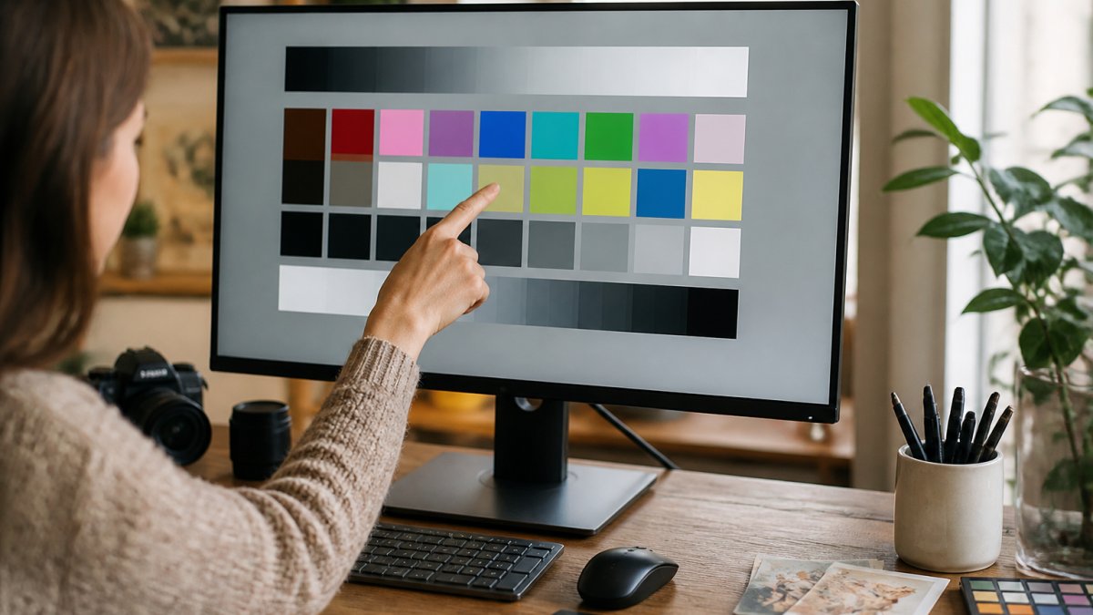
Start in a normal lighting environment, the same conditions where you'll be viewing products online. Avoid direct sunlight or glare. Open your browser and navigate to a color test website. Most tests display a series of color patches and patterns designed to reveal problems.
Using Color Patches and Test Patterns
Color patches are small squares of pure color used to check how your monitor reproduces specific hues. A good test includes patches for red, green, blue, cyan, magenta, yellow, and neutral gray. Look at each patch and ask: Does this color look pure, or does it shift toward another hue?
Test patterns go further. They show you how your monitor handles complex images. Frequency patterns (fine lines and grids) reveal sharpness and contrast issues. Gradient patterns show whether your display produces smooth color transitions or banding (visible stripes instead of smooth gradation).
Many browsers now support sRGB color space, which is the standard for web and e-commerce images. When you view a color test, you're checking whether your monitor can display the full sRGB gamut, the complete range of colors that sRGB defines. If your display can't show the full range, certain product photos will look wrong.
Checking Grayscale and Neutral Tones
Grayscale testing is crucial for spotting color casts. A proper grayscale gradient shows neutral gray tones from black to white with no color tint. If grays look slightly blue, red, or green, your monitor has a color cast that will affect how you see product photos.
Look at the grayscale bars on your test pattern. Each step should look like a neutral gray. If you see warm tones (reddish or yellowish), your monitor is biased toward warm colors. If you see cool tones (bluish), it's biased toward cool. This matters because it changes how you perceive the colors in apparel and art you're considering buying.
Neutral tones are especially important for evaluating white backgrounds in product photos. If whites look slightly yellow or blue on your monitor, you'll misjudge the actual color of the product.
Evaluating Gamma and Tonal Gradation
Gamma measures how smoothly your monitor transitions between brightness levels. A gamma of 2.2 is standard for most displays and web content. If your gamma is off, midtones will look either too bright or too dark, making it hard to judge color accurately.
Tonal gradation tests show whether your display produces smooth color transitions or banding. Banding appears as visible stripes in what should be a smooth gradient. Clipping occurs when your monitor can't display very dark or very light colors, they get crushed into pure black or pure white. Both problems make it harder to see the true colors in product photos.
Display Color Calibration for Better Accuracy
Once you've tested your monitor, you might need to adjust it. Most displays come from the factory with settings that don't match color standards. Calibration brings your display into alignment.
Adjusting Brightness and Contrast
Start with brightness. Set your monitor to a comfortable level for your typical viewing environment. Too bright washes out colors. Too dim makes them look muddy. A good starting point is around 100 candelas per square meter (cd/m²) for typical indoor viewing.
Contrast should be set to enhance image detail without crushing shadows or blowing out highlights. Most monitors have contrast set too high from the factory. Lower it slightly until dark areas show detail without looking gray.
These adjustments are available in your monitor's on-screen menu. Look for a button on the monitor's bezel that opens settings. Navigate to brightness and contrast controls. Make small adjustments and step back to evaluate.
Setting Your White Point and Color Temperature
White point determines what "white" means on your display. The standard for web content is 6500K (Kelvin), which is neutral daylight. Your monitor's color temperature setting controls this.
If your monitor displays a warm white point (3000-4000K), whites will look yellowish and all colors will shift toward warm tones. If it's set to a cool white point (9000K or higher), whites look blue and colors shift cool. Most monitors let you choose between preset white points or adjust manually.
Access this in your monitor's settings menu. Look for "color temperature" or "white point" options. Select 6500K or "daylight" if available. This single adjustment often improves color accuracy dramatically.
Browser Color Management Test: What You Need to Know
Your monitor can be perfectly calibrated and still show the wrong color if your browser mishandles the image's color profile. This section connects the pieces, display settings, color profiles, browser behavior, image color spaces, and export settings, into one workflow you can actually follow.
The Chain That Determines What You See
Color on screen is the end of a chain: the image file carries a color space (often sRGB, sometimes Display P3 or Adobe RGB), the browser reads that tag and converts it to your display profile, the operating system hands the result to the graphics pipeline, and the monitor renders it. A break anywhere in that chain shifts color. The most common breaks are an untagged image, a browser that ignores profiles, and a display profile that does not match the monitor's actual behavior.
The Tagged vs. Untagged Test
Open a test page that shows the same image twice, once tagged with an sRGB profile and once stripped of its profile. If the two versions look identical, your browser is likely treating untagged images as sRGB, which is the usual default and usually fine. If they look different, your browser is applying profile conversion to the tagged version, which is what you want. If the tagged version looks worse, oversaturated or shifted, suspect a bad display profile rather than the browser.
Checking Your Browser and OS Settings
On Windows, confirm your monitor's ICC profile is installed and associated with the correct display under Color Management in the Control Panel. On macOS, profiles are managed in System Settings under Displays. In Chrome, Firefox, and Safari, color management is generally automatic when the OS provides a valid display profile, there is rarely a toggle to flip. The practical check is the tagged/untagged test above: if it behaves as expected, the chain is working.
A Repeatable Cross-Device Workflow
Identical appearance across every screen cannot be guaranteed, panels, gamuts, and viewing conditions differ. What you can do is build a repeatable check so you know which device to trust:
- Set a baseline on your primary device. Calibrate brightness and white point, run the gradient and grayscale tests, and confirm browser color management with the tagged/untagged test.
- Pick a reference image. Use a product photo with a known neutral (a white or gray background) and a saturated accent color.
- Compare representative devices side by side. Open the same image on your phone, tablet, and desktop. Note which device makes neutrals look neutral and which pushes them warm or cool.
- Record the direction of error, not just "different." If your phone runs cool and your desktop runs warm, you can mentally correct when shopping on either.
- Make color-critical decisions on the device you have validated. For most people that is the desktop or laptop that has been through steps 1-4.
Realistic Expectations by Use Case
- Everyday browsing and shopping: a display covering most of sRGB with a sensible white point is enough. Do not chase perfection.
- Photography and design: you need a profiled display and a browser you have verified with the tagged/untagged test, because you are judging subtle shifts.
- Printing: screen color will never match ink on paper exactly; treat the screen as a guide and rely on soft-proofing in your editing software.
- Ecommerce product images: sellers should publish sRGB-tagged images with a neutral reference in frame; buyers should check those images on a validated device.
- Accessibility and visual conditions: color-vision differences, ambient lighting, viewing angle, and brightness adaptation all change perceived color in ways no test page can correct. View products in the lighting where you will use them, and if color discrimination is a concern, ask the seller for a description of the color in words as well as a photo.
At YleaCreations, we tag our product images for sRGB and shoot against neutral references so the colors in our store survive the trip from our camera to your calibrated screen. Run the workflow above once, and the colorful apparel, animal art, and accessories you see will be the ones you receive.
Assessing sRGB Color Gamut and Color Space Coverage
sRGB is the color space used by most e-commerce sites and product photos. It defines a specific range of colors that your monitor should be able to display. Not all monitors can show the full sRGB gamut.
A monitor with 100% sRGB coverage can display every color defined by the sRGB standard. Monitors with 95-99% coverage miss a small portion, usually deep saturated colors like vivid reds or cyans. For shopping purposes, 95% coverage is usually fine. The differences are subtle.
Test your monitor's sRGB coverage by viewing color gamut test patterns. These show the full range of sRGB colors. If your monitor can display all of them without clipping, you have good coverage. If certain colors look dull or washed out, your gamut is limited.
This matters most when you're buying vibrant apparel or art. If your monitor can't show the full sRGB gamut, you might think a color is duller than it actually is. Conversely, if your monitor oversaturates colors, you might expect more vibrancy than the product actually has.
Testing Across Devices: Mobile, Tablet, and Desktop
Color accuracy online becomes more complex when you shop on multiple devices. Your desktop monitor, phone, and tablet each have different displays with different color characteristics. A color that looks perfect on your desktop might look different on your phone.
Test the same product photo on all your devices. Open the product page on your phone, tablet, and computer. Look at the same item on each screen. Do the colors match? If not, which device is most accurate?
Most phones and tablets have smaller gamuts than desktop monitors, so colors often look more saturated on mobile. This means if you're shopping on your phone, you might overestimate how vibrant the colors are. If you're shopping on a desktop with good color accuracy, you'll get a more realistic view.
When possible, make final purchasing decisions on the device where you'll see the most accurate colors. If your desktop monitor has been calibrated and tested, use it for color-critical purchases. If you're buying on your phone, remember that colors might look more vibrant than they actually are.
Practical Tips for Ensuring Accurate Colors in Your Online Orders
Beyond testing and calibration, several practical steps improve your confidence in online color purchases.
First, check product reviews and customer photos. Real customers post pictures of items they've received, often in different lighting conditions. These photos show how colors actually look in real life, not just on a calibrated monitor. Look for reviews from customers with similar lighting in their homes.
Second, ask sellers about their color management practices. At YleaCreations, we're committed to accurate color representation. We photograph products in consistent lighting, use color reference standards, and ensure our product images match the actual items. When a seller takes color seriously, they'll be happy to explain their process.
Third, understand that lighting matters. A color that looks perfect under cool office lighting might look different under warm home lighting. When you receive your order, view it in the lighting where you'll actually use it.
Fourth, use your browser's developer tools to inspect image color profiles. Right-click a product image and select "Inspect." Look for color profile information in the image metadata. If the image is tagged with a color profile, your browser should display it accurately.
Finally, trust your eyes but verify with reference. If a product photo shows a specific color you care about, look for a color reference in the image, something you know the true color of, like a white background or a known brand's logo. Use that reference to mentally adjust for any color cast you notice.
Getting the colors right when you shop online doesn't require expensive equipment or technical expertise. A few simple tests and adjustments to your monitor make a real difference. When you understand how color accuracy online works, you can buy with confidence knowing the vibrant, expressive pieces you see are the ones you'll receive.
Ready to shop with color confidence? Visit our store at YleaCreations to explore our curated collection of colorful apparel, animal art, and mood-lifting accessories. We're committed to ensuring the vibrant designs you see are exactly what arrives at your door.
Frequently Asked Questions
Can I test my display color online without special equipment?
Yes. Online test patterns and color patches let you evaluate how your monitor displays color accuracy without buying a colorimeter. Use free browser-based tests to check grayscale neutrality, gamma gradation, and color banding. These tests show you how well your display reproduces colors, though they can't fully calibrate your monitor the way hardware calibration can. For apparel shopping, online testing helps you spot if your display has color casts or uneven brightness that might affect how you perceive product photos.
What's the difference between color calibration and color accuracy testing?
Color accuracy testing measures how well your monitor displays colors compared to a standard (like sRGB). Online tests reveal if your display has problems with color reproduction, brightness, or contrast. Display color calibration is the process of adjusting your monitor's settings to match a target color space. Testing identifies the problem; calibration fixes it. For online shopping, testing tells you whether colors in product photos are trustworthy, while calibration ensures your monitor displays those colors consistently.
Does browser color management affect how colors look when I shop online?
Yes. Browser color management determines how your browser interprets and displays color data from websites. If your browser doesn't support color profiles or if color management is disabled, tagged images may look different than intended. Most modern browsers support color management, but settings vary. When shopping online, ensure your browser is set to use color management so product photos display as the seller intended. This is especially important for vibrant apparel designs where color accuracy directly affects your purchasing decision.
Is 95% sRGB color gamut good enough for online shopping?
Yes. sRGB is the standard color space for web content and online retail. A monitor with 95% sRGB coverage displays web colors accurately and is more than adequate for shopping online and viewing product images. Most apparel and product photos are designed for sRGB, so a display that covers 95% of the sRGB gamut will show you colors very close to what the seller intended. Higher gamut coverage (like 100% Adobe RGB) is useful for photo editing but unnecessary for evaluating products online.