 how-to
How Do You Spot Quality Screen Printing?
Last Updated: October 24, 2026
Quick Summary
To spot quality screen printing, look for crisp, clean edges, even ink coverage across the entire design, and colors that are bright and vibrant. The print should feel smooth and flex with the fabric without cracking, and small details like text should be sharp and readable.
- Check for sharp edges, even color coverage, and no thin spots or streaky areas on the print
- Run your finger across the print lightly; it should feel smooth and bonded to fabric, not gritty or rough
- Bend the garment gently at the print; quality prints flex with the fabric and don't crack or peel
- Test durability by washing three times in warm water, then inspecting for cracks, fading, or edge flaking
- Compare visual and tactile clues to screen printing's distinct raised edges and opaque colors versus DTG or heat transfers
Table of Contents
- What Makes Quality Screen Printing Stand Out
- Visual Inspection: What to Look for in a Screen Printed Garment
- Evaluating Ink Coverage and Color Brightness
- Testing Print Feel and Wearability
- Screen Printing Quality Checklist for Buyers
- Identifying Common Screen Print Defects
- Assessing Screen Printing Durability and Wash Performance
- Understanding Screen Printing Registration and Alignment
- How Screen Printing Compares to Other Printing Methods
- Finding Quality Screen Printed Pieces at YleaCreations
- Frequently Asked Questions
What Makes Quality Screen Printing Stand Out
Spot quality screen printing comes down to a few core things: how well the ink sits on the fabric, how vibrant the colors stay, and whether the print feels right when you wear it. At YleaCreations, we've learned that spotting quality screen printing isn't complicated once you know what to look for.
The best prints have crisp edges, even ink coverage, and colors that pop. They don't feel stiff or plasticky. They don't crack when you wash them. A quality screen print should feel like part of the garment, not something slapped on top.
Here's what separates a well-made print from one that won't last: the printer's attention to detail during setup, the ink they choose, and how they cure it. Understanding these basics helps you avoid disappointment when you buy.
Visual Inspection: What to Look for in a Screen Printed Garment
Start by looking at the print straight on, then hold it to the light. You're checking for three things: how clean the edges are, whether the colors look even, and if there are any thin spots.
Clean edges matter. The ink should stop where the design stops. Fuzzy or bleeding edges mean the stencil wasn't tight enough or the squeegee pressure was wrong.
Even color coverage across the whole print is key. Dark spots, light spots, or streaky areas signal uneven pressure during printing. The entire design should look uniform.
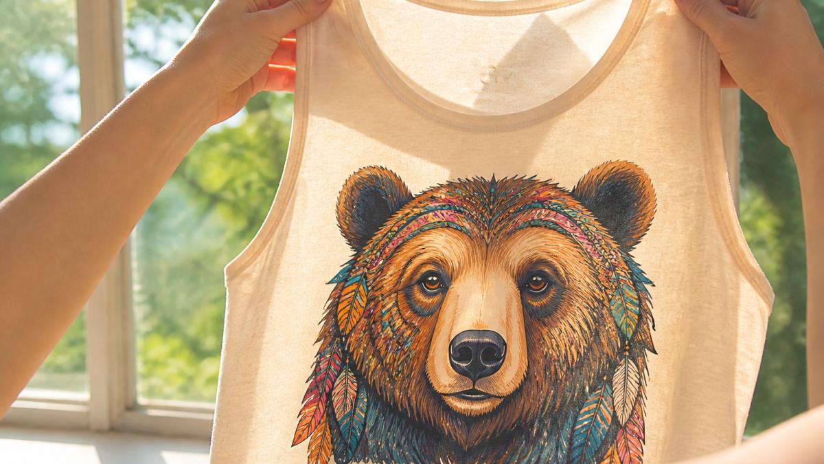
Check for small details. If your design has thin lines or small text, they should be sharp and readable. Thin lines that look broken or blurry mean the screen resolution was too low or the ink was too thin.
Look at the back of the garment. You shouldn't see heavy ink buildup on the reverse side. A little show-through is normal, but the back should stay mostly clean.
Evaluating Ink Coverage and Color Brightness
Ink coverage is about how much ink the printer laid down. Too little and colors look pale and wash out quickly. Too much and the print feels stiff and cracks easily.
Run your finger across the print lightly. It should feel smooth, not gritty or rough. The ink should be bonded to the fabric, not sitting loose on top.
Bright colors come from good ink and proper curing. If colors look dull or muddy right out of the box, the printer either used low-quality ink or didn't cure it properly. Quality inks hold their brightness through many washes.
White ink prints need extra attention. White should be opaque and bright, not see-through or yellowed. Poor white ink makes other colors printed on top of it look washed out.
Testing Print Feel and Wearability
The print should feel soft, not stiff or plasticky. Grab the fabric where the print is and where it isn't. The difference shouldn't be dramatic. A stiff print will crack when you bend or move.
Bend the garment gently at the print. Quality prints flex with the fabric. Bad prints crack or peel at the edges when you bend them.
Wear the garment. After a few hours, a quality print should feel like it's part of the shirt. If it feels uncomfortable or restricts movement, the ink was applied too thick or the wrong ink type was used.
Screen Printing Quality Checklist for Buyers
Use this checklist when you're evaluating a screen printed piece:
- Edges are sharp and clean, not fuzzy or bleeding
- Color is even across the entire design
- No thin spots, light areas, or streaky coverage
- Small details like thin lines and text are crisp and readable
- Back of garment has minimal ink show-through
- Print feels smooth, not gritty or rough
- Colors are bright and vibrant, not dull or muddy
- Print flexes with the fabric, doesn't feel stiff
- Print doesn't crack when you bend the garment
- Garment feels comfortable to wear
If a print fails more than one or two of these checks, it's likely a lower-quality job.
Identifying Common Screen Print Defects
Cracking happens when the ink layer is too thick or too stiff. It shows up as lines or breaks in the design, usually where the fabric bends. This gets worse with washing.
Fading occurs when the printer didn't cure the ink properly or used low-quality ink. Colors fade unevenly, sometimes leaving ghost images of the design.
Pilling and peeling happen at the edges when the ink wasn't bonded well to the fabric. The print starts to flake off after a few washes.
Misalignment means different colors in the design don't line up. You see a slight blur or color shift where layers should meet. This happens when the printer didn't register the screens correctly.
Color shifting means the print looks one way in the store but different when you get it home. This usually means the ink wasn't mixed correctly or the screen was too old.
Watch for these common defects that signal lower quality screen printing.
| Defect | Cause | What It Looks Like |
|---|---|---|
| Cracking | Ink layer too thick or too stiff | Lines or breaks in design, worse with washing |
| Fading | Improper curing or low-quality ink | Uneven color loss, ghost images of design |
| Pilling and peeling | Poor ink bonding to fabric | Flaking at edges after a few washes |
| Misalignment | Screens not registered correctly | Blur or color shift where layers meet |
| Color shifting | Incorrect ink mixing or old screen | Print looks different at home than in store |
Assessing Screen Printing Durability and Wash Performance
Durability is where a screen print either proves itself or falls apart. Learn why custom apparel prints fade fast and how to prevent it. Most competitors stop at "it should last 50 washes" without telling you how to verify that claim. Here is a practical, at-home durability protocol you can run on any screen-printed garment before you commit to a purchase or a bulk order.
The Three-Part Home Durability Test
Run these checks in order. Each one isolates a different failure mode: wash resistance, mechanical stretch, and surface abrasion.
1. The Wash Test (fading and cracking)
Wash the garment three times in warm water (around 105°F) with a normal detergent load, then tumble dry on medium heat each time. This accelerates the wear of roughly 15-20 normal wash cycles. After the third dry cycle, inspect the print under bright light:
- Pass: Colors look nearly identical to the day you bought it; no visible cracks at fold lines; edges remain sharp.
- Marginal: Slight dulling of bright colors (especially white and red); hairline cracks only visible when the fabric is stretched.
- Fail: Visible cracking across the design, color shift of more than one shade, or edges that have begun to flake.
A common pattern is that poorly cured ink fails this test by the second wash. Properly cured plastisol or water-based ink should survive all three cycles with only minor dulling.
2. The Stretch Test (adhesion and flexibility)
Grab the fabric on opposite sides of the print and pull firmly until the garment stretches about 20% beyond its resting width. Hold for five seconds, release, and inspect:
- Pass: The ink stretches with the fabric and returns to its original shape; no white lines appear at the edges.
- Marginal: Fine hairline cracks appear during the stretch but close up when released.
- Fail: The ink cracks visibly and stays cracked, or the edges lift from the fabric.
This test reveals whether the ink was properly bonded and whether the ink layer is thin enough to flex. A stiff, thick ink layer will fail even if the curing was correct.
3. The Abrasion Test (surface wear)
Rub the printed area firmly with a dry, clean cloth or your thumb for about 30 seconds, applying moderate pressure. Then rub a small area with a damp cloth. Check for ink transfer to the cloth or a change in the print's surface sheen:
- Pass: No ink transfers to the cloth; the print's surface looks unchanged.
- Marginal: A faint tint on the cloth, but the print itself looks intact.
- Fail: Visible ink on the cloth or a bald patch where ink has rubbed away.
Abrasion failure usually points to under-curing or an ink that was never formulated for the fabric type.
What the Results Mean
If a print passes all three tests, it is genuinely spot quality screen printing. If it fails one test, the print may still be acceptable for low-wear applications but will likely degrade faster than expected. If it fails two or more, the print is not quality screen printing regardless of how good it looked in the store.
Keep in mind that fabric choice affects durability outcomes. Tight-weave cotton holds ink best; loose knits and synthetic blends can cause ink to sit on the surface and fail the stretch and abrasion tests more easily. White ink and bright colors are also more prone to visible fading, so judge them against the same test rather than against darker prints.
When you are evaluating screen printed pieces from YleaCreations, you can apply these same tests with confidence. Shop our collection of quality screen printed apparel and see how our prints hold up to real-world wear.
Understanding Screen Printing Registration and Alignment
Registration is how well different ink colors line up in a multi-color print. Perfect registration means each color sits exactly where it should. Poor registration creates blurry edges where colors meet.
Look for slight color halos around the design edges. A tiny halo (less than 1/32 inch) is acceptable. Larger halos mean the screens weren't registered well during printing.
Test registration by looking at the print from different angles. Misalignment becomes more obvious when you tilt the garment. Quality printers catch this before the garment leaves the shop.
Alignment also affects how the design looks on the garment. It should be centered or positioned exactly where the customer expects it. Off-center prints suggest careless setup.
How Screen Printing Compares to Other Printing Methods
Knowing that screen printing is durable is not the same as being able to tell it apart from direct-to-garment (DTG) printing or heat transfers when you are holding a garment in your hands. Most guides describe the methods in theory but never give you the visual and tactile clues that separate them. This section does.
Side-by-Side Identification Guide
Use these observable differences to identify the printing method. No special tools required, just your eyes and fingers.
Screen printing
- Visual: Ink sits in a distinct layer on the fabric. Edges are sharp and slightly raised. Colors are opaque and consistent, even on dark garments. Fine details are limited by mesh count, very small text may fill in slightly.
- Tactile: You can feel the ink layer with your fingertip, especially on thicker designs. The print has a slight texture, not perfectly smooth like a photograph. On high-quality prints, the ink flexes with the fabric without cracking.
- Under light: Hold the garment up to a bright light. Screen-printed areas block light more than the surrounding fabric, and the ink layer casts a subtle shadow at the edges.
Direct-to-garment (DTG) printing
- Visual: The print looks more like a photograph or inkjet print. Colors can be very detailed and gradients are smooth. However, on dark garments, DTG often requires a white underbase, which can give the print a slightly grainy or speckled appearance. Edges may look softer than screen printing.
- Tactile: The print feels much softer and thinner, often nearly flush with the fabric. You may not feel a distinct ink layer at all. This softness is a DTG hallmark, but it also means the print may not be as durable.
- Under light: DTG prints do not block light as strongly as screen prints. The ink sits closer to the fabric surface and may show the fabric texture through the print.
Heat transfers
- Visual: Transfers often have a plasticky sheen and a uniform, flat appearance. Edges can look slightly raised or have a visible border where the transfer film ended. Colors may look less vibrant or slightly washed out compared to screen printing.
- Tactile: The print feels like a sticker or a patch sitting on top of the fabric. It is often stiff and does not flex well. You may feel a distinct edge where the transfer meets the fabric.
- Under light: Transfers can look slightly glossy or reflective. The ink layer is typically thicker and more uniform than screen printing, but lacks the fabric-integrated feel.
What These Clues Can and Cannot Prove
These visual and tactile clues are strong indicators, but they are not definitive. A very high-quality DTG print on a light garment can mimic the softness of screen printing, and a low-quality screen print with too much ink can feel stiff like a transfer. The most reliable way to confirm the method is to combine these observations with the durability tests in the previous section. Screen printing typically passes the stretch and abrasion tests better than DTG or transfers.
Why This Matters for Buyers
Understanding these differences helps you ask better questions. If a seller claims a garment is screen printed but the print feels flush with the fabric and shows photographic detail, it may be DTG. If the print has a plasticky sheen and a visible border, it may be a transfer. Neither method is inherently bad, but they have different durability profiles and price points. Screen printing remains the most durable option for bold, long-lasting designs when executed well.
At YleaCreations, we use screen printing for its durability and vibrant color payoff. Explore our screen printed apparel and see the difference for yourself.
Finding Quality Screen Printed Pieces at YleaCreations
We focus on quality at every step. Our screen printed apparel and accessories are made with vibrant, durable inks that stay bright through many washes. Each piece is designed to feel comfortable and look great.
When you buy from us, you're getting prints that pass every quality check. We care about how the print feels, how the colors look, and how long it lasts. Our pieces are made for people who want their clothes to reflect who they are.
Shop our collection of quality screen printed apparel and find pieces that match your style. Whether you're looking for animal-themed designs, bold art, or mood-lifting prints, we have something for you.
Frequently Asked Questions
How can you tell if a screen print is high quality?
A quality screen print displays vibrant, consistent ink color across the entire design with no fading or thin spots. The ink should feel smooth and slightly raised, not cracked or peeling at the edges. Look for sharp detail in fine lines and small text, proper registration where colors align perfectly, and an even print surface without puckering or wrinkles in the fabric underneath.
What should a good screen print look and feel like?
Quality screen printing feels soft and flexible on fabric, not stiff or plasticky. Visually, the design should have crisp edges, consistent color saturation, and no bleeding where inks blur into adjacent areas. The print should maintain its appearance when the garment is stretched slightly, and the ink coverage should be opaque enough that the fabric color doesn't show through unless the design intentionally uses transparency.
Does screen printing crack or fade after washing?
Quality screen printing resists cracking and fading through multiple wash cycles when properly cured. Poor quality prints may show cracking, peeling, or color loss after just a few washes. The difference comes down to ink type, curing temperature, and application technique. Testing durability at home involves washing a sample garment in warm water with similar colors and checking for any breakdown of the print after 5-10 cycles.
How does screen printing compare with other shirt-printing methods?
Screen printing produces thicker, more durable ink layers than direct-to-garment printing, which creates a softer feel but may fade faster. Heat transfers create a plastic-like feel and often crack with wear. Screen printing offers superior color vibrancy and longevity for bold, colorful designs, making it ideal for pieces meant to last. Each method has trade-offs in cost, durability, and aesthetic, screen printing excels for lasting quality and vibrant artwork.
Spotting quality screen printing comes down to knowing what to look for: sharp edges, even color, soft feel, and durability through washing. These signs tell you whether a print will last or fade fast. When you understand these basics, you can buy with confidence and find pieces you'll love wearing for years.